Search results
Create the page "Green" on this wiki! See also the search results found.
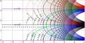
File:Exp1mapT200.jpg The additional thick green lines show $u=\Re(L)$ and $v=\Im(L)$ where $L\approx 0.3+1.3 \mathrm i $ is(2,281 × 1,179 (1.14 MB)) - 12:37, 28 July 2013- ...t of \(\exp^n\) and \(\Im(L)\) for the imaginary part are drown with thick green lines; of course, these lines cross each other at the branch point \(L\).7 KB (1,161 words) - 18:43, 30 July 2019
- life, I have given every green herb for meat: and it was so. green herb have I given you all things.4.15 MB (793,089 words) - 18:44, 30 July 2019
- ...duced bombs specifically designed to deploy sarin from a warplane, has two green bands. The circular object seen in photos of the crater appears similar to53 KB (1,029 words) - 22:45, 19 September 2020
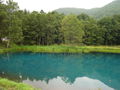
File:01044greenLake.JPG Green lake in Japan(1,280 × 960 (609 KB)) - 08:23, 1 December 2018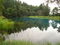
File:01053greenLake.JPG Green lake in Japan(1,280 × 960 (601 KB)) - 08:23, 1 December 2018
File:02243kirohana.jpg [[Category:Green]](2,048 × 1,536 (1.35 MB)) - 08:23, 1 December 2018
File:02244kirohana.jpg [[Category:Green]](2,048 × 1,536 (1.14 MB)) - 08:23, 1 December 2018
File:02931DevchonkaGreen.jpg Green jacket and green tea.(3,648 × 2,736 (3.34 MB)) - 08:24, 1 December 2018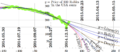
File:2014.12.26rubleDollar.png The green thick curve represents the experimental data(1,502 × 651 (246 KB)) - 08:26, 1 December 2018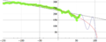
File:2014.12.29fitA300.png The green dots correspond to the data by(1,500 × 603 (100 KB)) - 08:26, 1 December 2018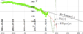
File:2014.12.29rubleDollar.png The green dots (taht form the scratched green line) represent the data from https://www.mataf.net/en/currency/converter-U The dark green oscillating curve represents the fitting of experimental data with function(1,502 × 610 (142 KB)) - 08:26, 1 December 2018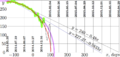
File:2014.12.31rudo.png The thick green curve represents the experimental data by(1,452 × 684 (190 KB)) - 08:26, 1 December 2018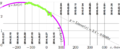
File:2014arc.png available for 29 November 2014 (thick green line),(1,726 × 709 (155 KB)) - 08:26, 1 December 2018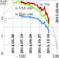
File:2014ruble15t.png Price of Russian rubble, expressed in Japanese yen (red), in the USA cents (green) and in the Euro cents (blue), versus time.(693 × 680 (110 KB)) - 08:26, 1 December 2018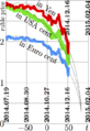
File:2014ruble17t.png in the USA cents (green)<br>(456 × 664 (98 KB)) - 08:26, 1 December 2018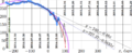
File:2015.01.01rudo.png These data are shown with light blue line, instead of green in the case of http://mizugadro.mydns.jp/t/index.php/File:2014.12.31rudo.pn ...account, fitting the data, is $x\!=\!-235$; this coordinate is marked with green vertical line. In order to show the limit of approximation, some more data(1,660 × 684 (215 KB)) - 08:26, 1 December 2018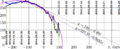
File:2015.01.03rudo.png The green ellipse represents the approximation(1,660 × 684 (212 KB)) - 08:26, 1 December 2018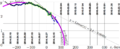
File:2015arc.png available for 29 November 2014 are shown with thick green line,(1,726 × 709 (190 KB)) - 08:26, 1 December 2018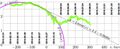
File:2015ruble2.jpg (thick green line).(1,726 × 709 (248 KB)) - 08:26, 1 December 2018


